Glaciers
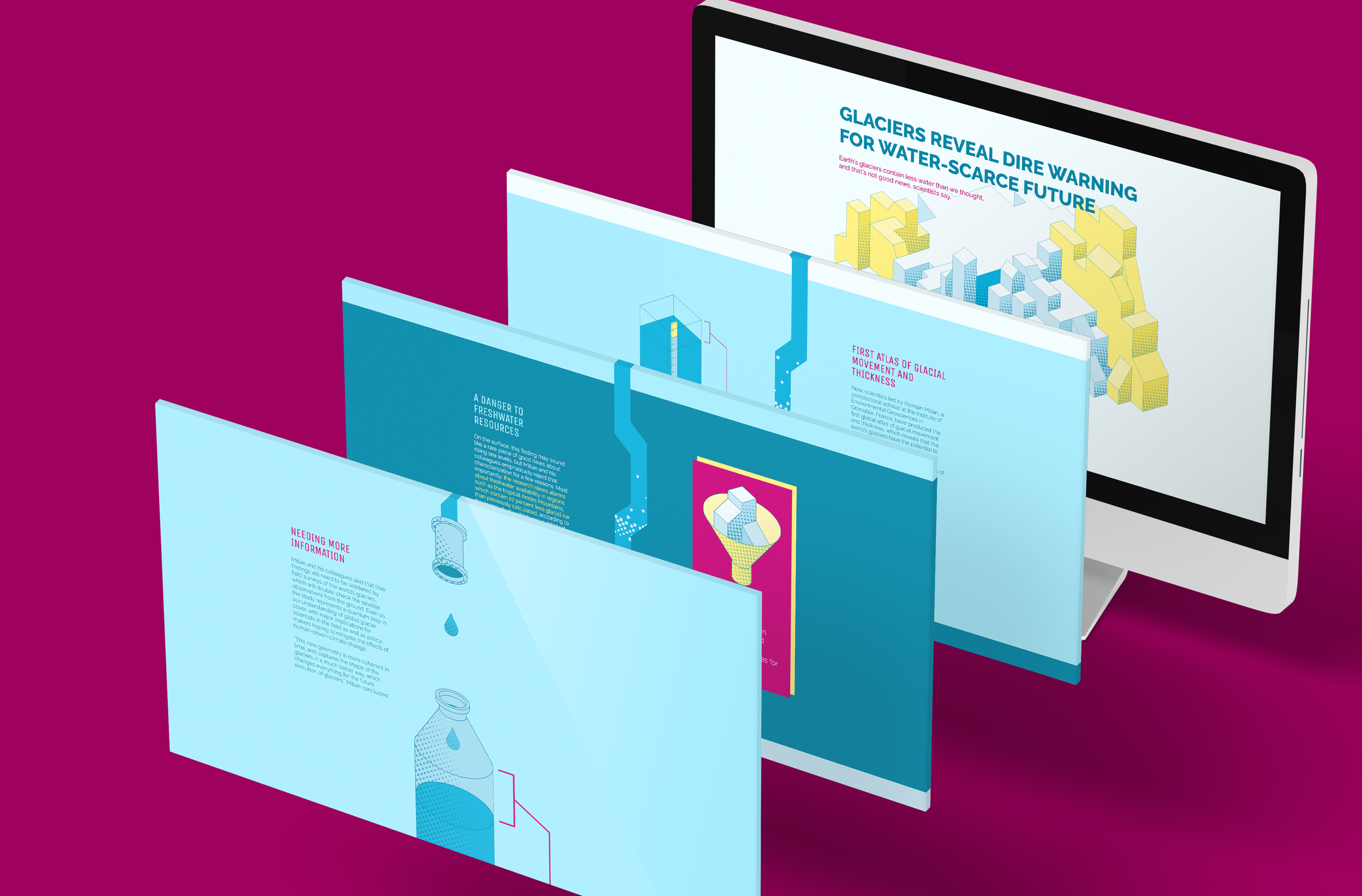
Glaciers was a project taking an existing editorial piece, (In this case, Vice’s First 'Atlas' of World Glaciers Reveals Dire Warning for Water-Scarce Future) and coding it as a responsive website.
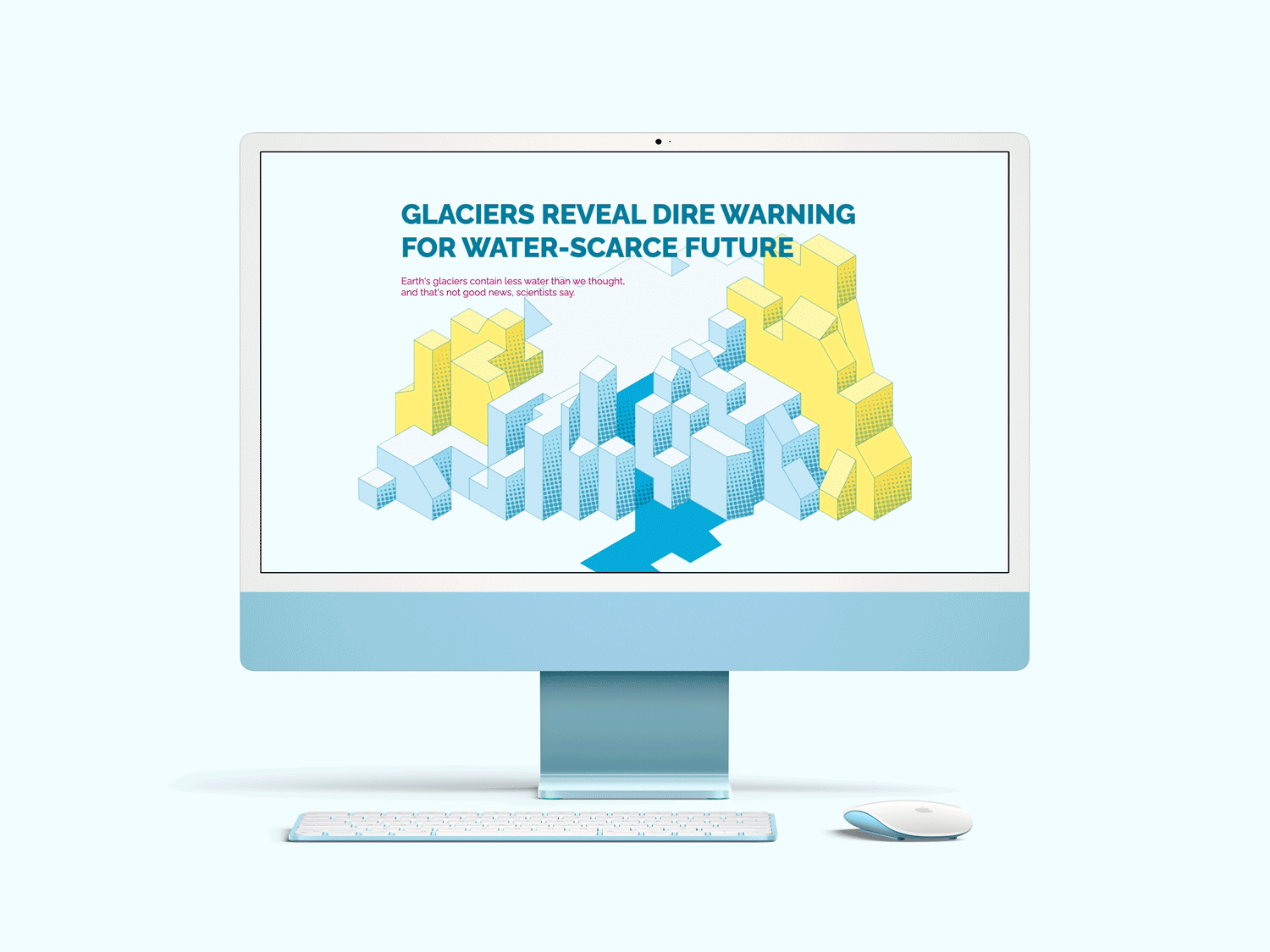
Final Outcome
As the concept centers on a user’s scroll through the site, the final outcome is best viewed in motion.
Process

Early Stages
The first phase of this project was picking a story. The Vice article stood out to me as an interesting topic that would normally lose readers due to a perception of dryness. I focused on the idea of bringing out the interesting parts of the subject matter via a bright but not silly design style.
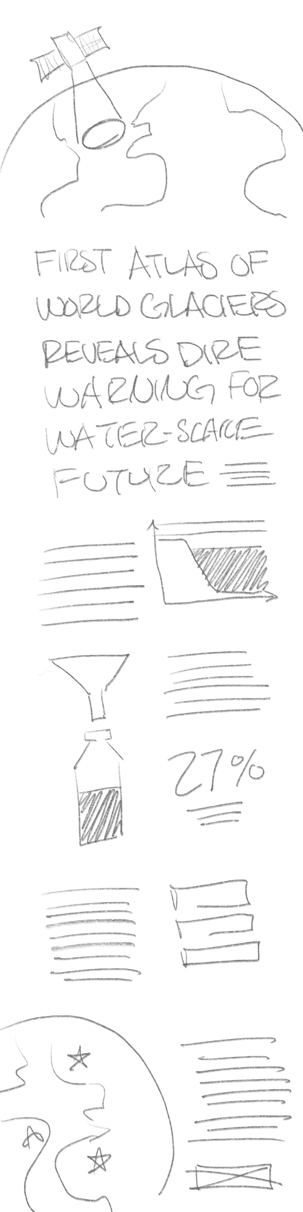
As I began to sketch layouts for the site, I sought professional but engaging layouts which would allow for a large number of isometric illustrations.


Iterations
I settled on a concept involving a strong vertical-scroll interaction: the site would have a “river” flowing down the middle of it, which would fill with water as the user scrolled. the water would come from the melting of the glacier in the header image and end dripping into a water bottle, giving the site a visual narrative tying glaciers to drinking water and reinforcing the message of the text.
After choosing my concept, I iterated on the layout and the illustrations.

Coding
Coding the site was the final and longest step. Using Skeleton as a base, I first set about creating the illusion of the flowing river, via primarily a series of layered PNG images. The rest of the site was constructed with columns, still images, animated GIFs, and CSS transitions.
Glaciers is both tablet and mobile friendly, fully tested at all common browser sizes and in three of the most common browsers, Chrome, Safari, and Firefox.