
Human Origins
Human Origins was my Western Washington University Honors Program Senior Capstone Project. Professor Alyson Rollins of the Anthropology department advised me while I wrote, illustrated, and designed it.
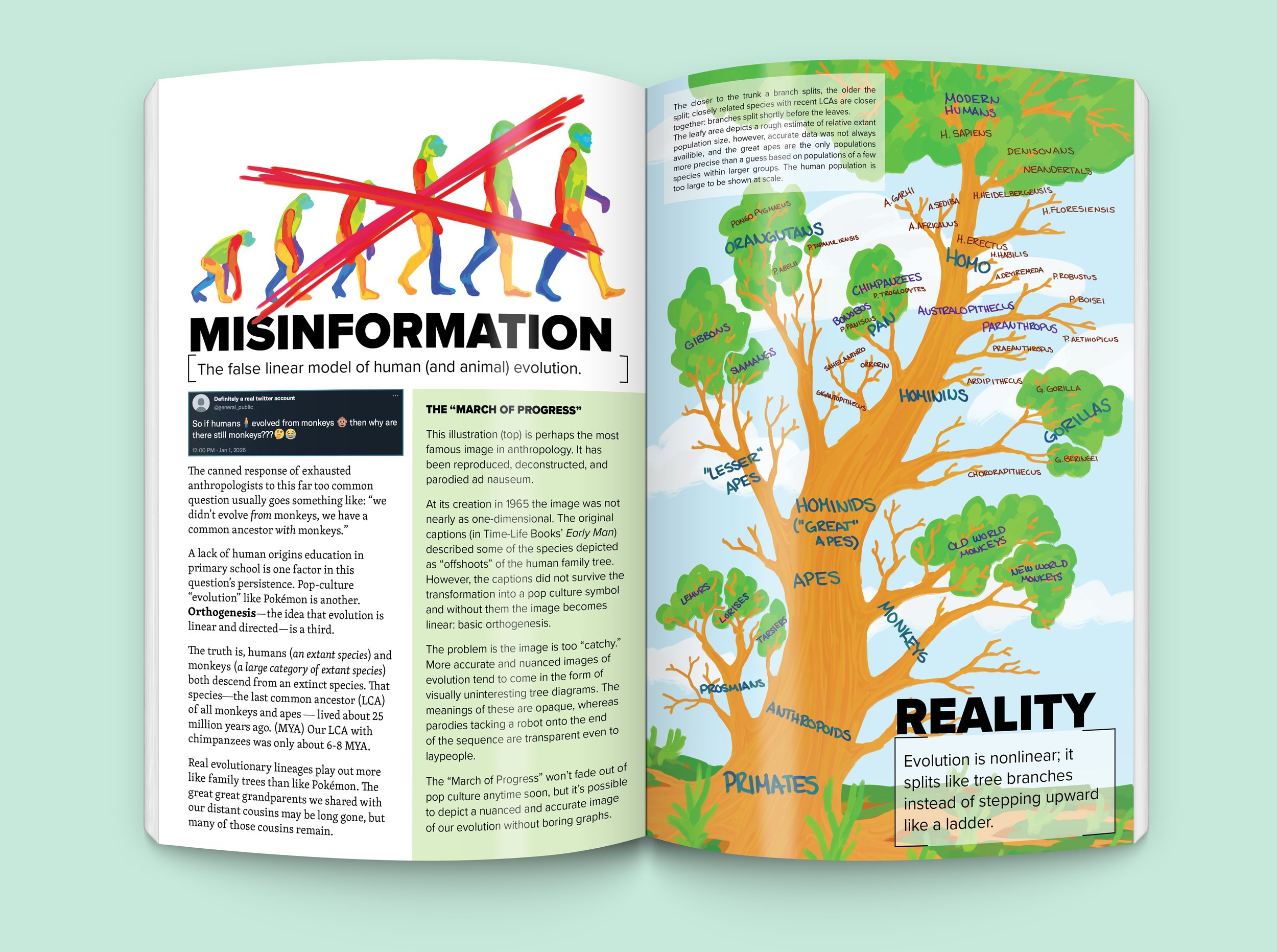
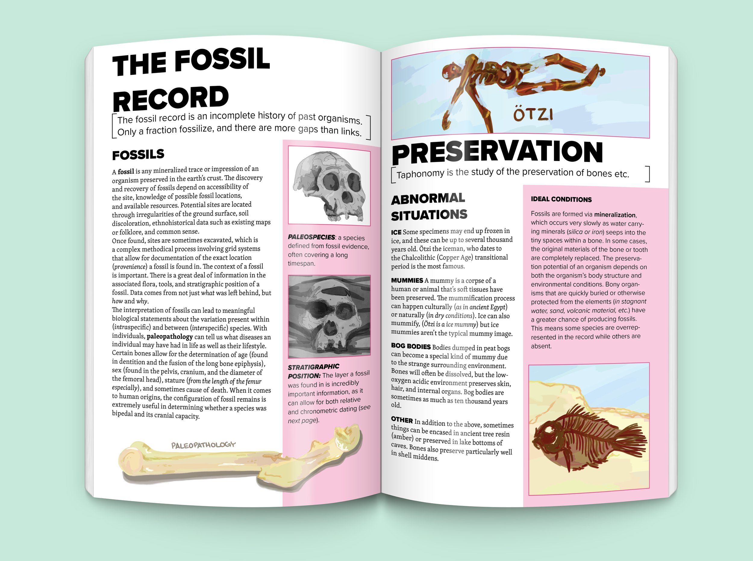
Though Human Origins was a school project, it was a passion project as well. Misinformation about human evolution and anthropology in general is extremely widespread in pop culture and on the internet, and few people have a chance to learn about the topic in school without pursuing an anthropology degree or minor. The driving force behind Human Origins was a desire to bring anthropology out of college classrooms and dispel the sort of pop culture misinformation spread by Geico “caveman” comercials. For that reason, the book is intended to fall somewhere between textbook and infographic in visual design, and it is formatted to be printed as a saddle stapled or perfect bound American comic book, which is what supplies the “Infocomic” subtitle. It is not published yet, but when it is it will be easy to print inexpensively, furthering the goal of making anthropology accessible to a greater percentage of the population.
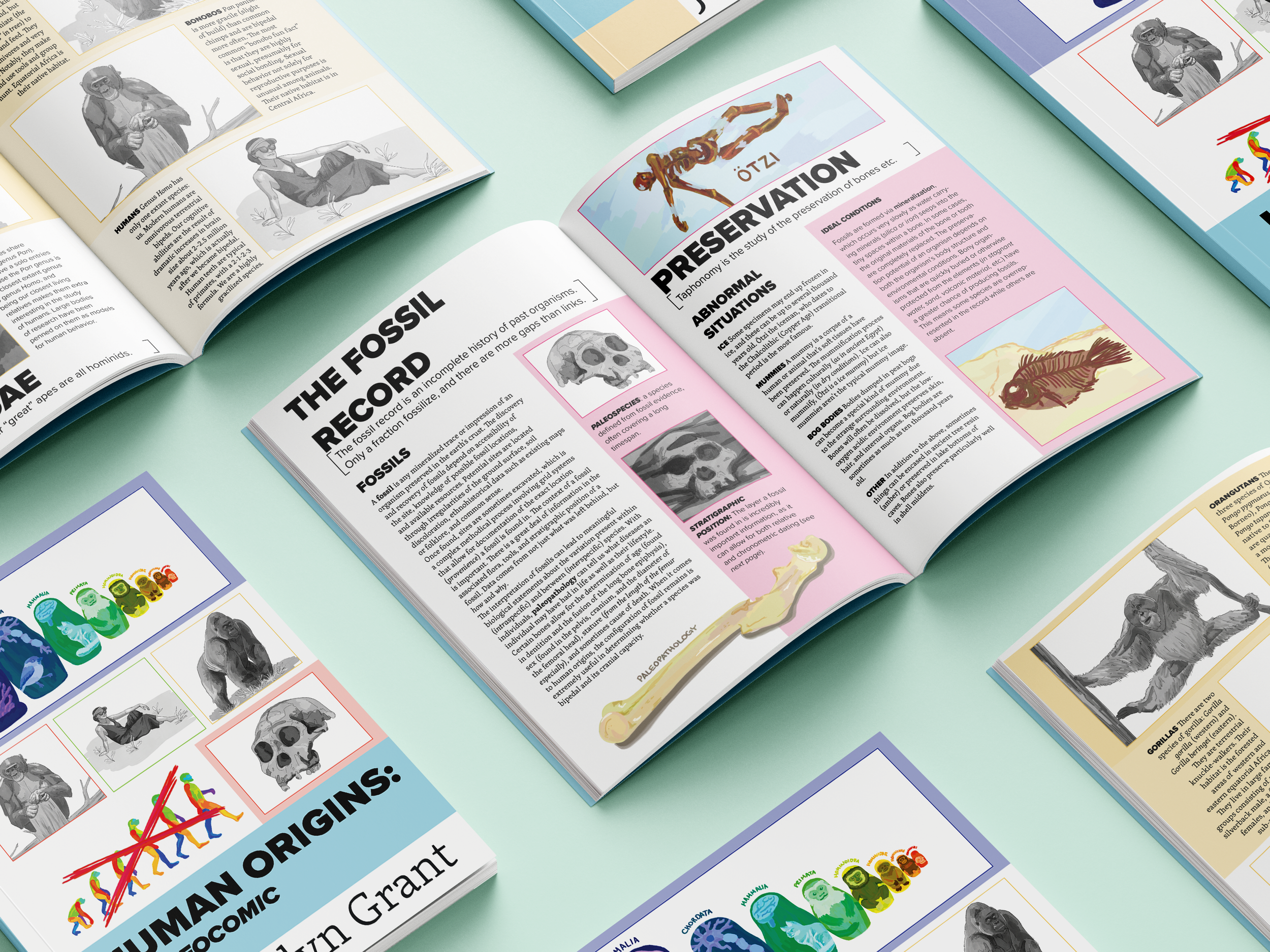
Selection of Spreads

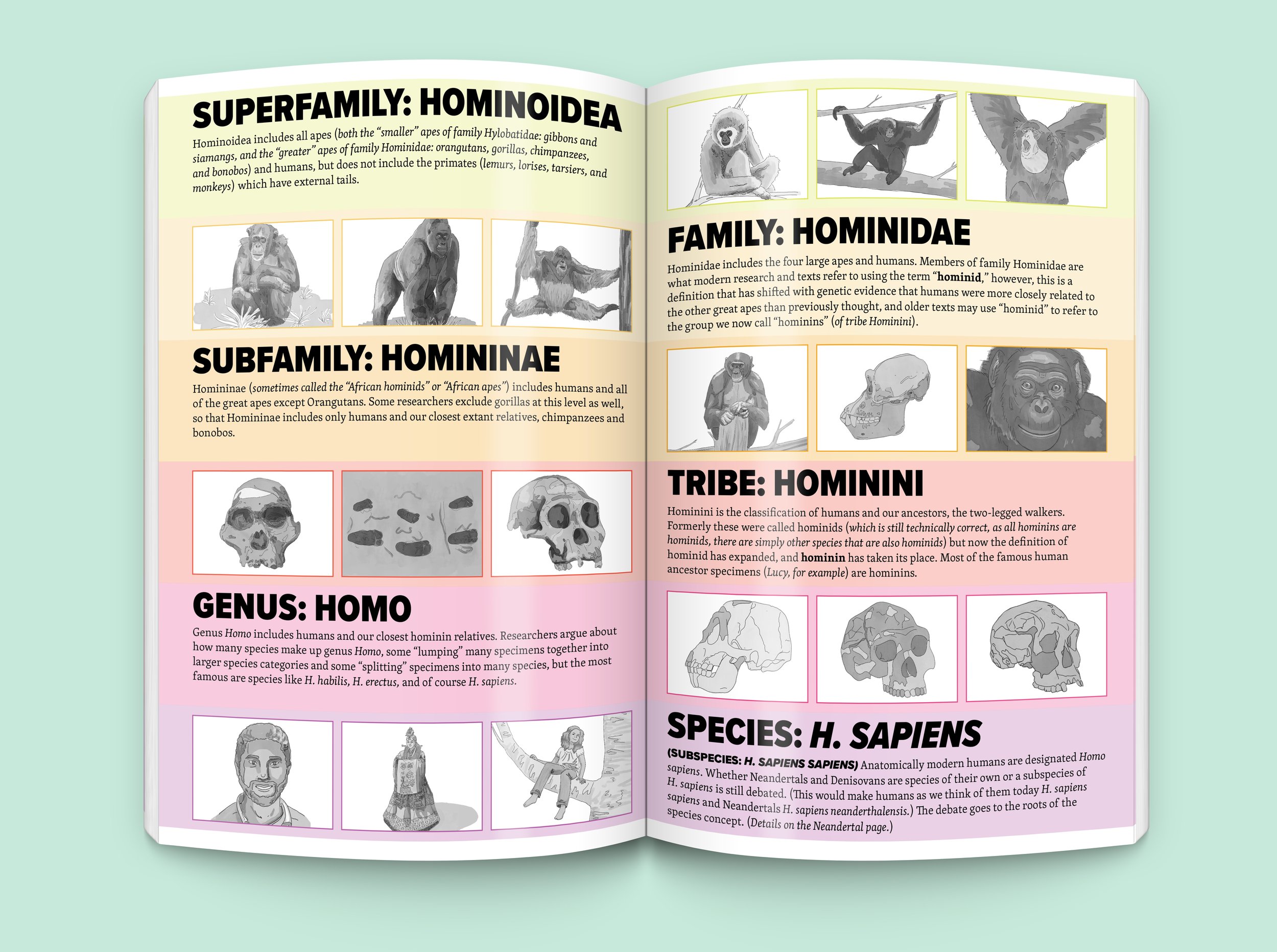
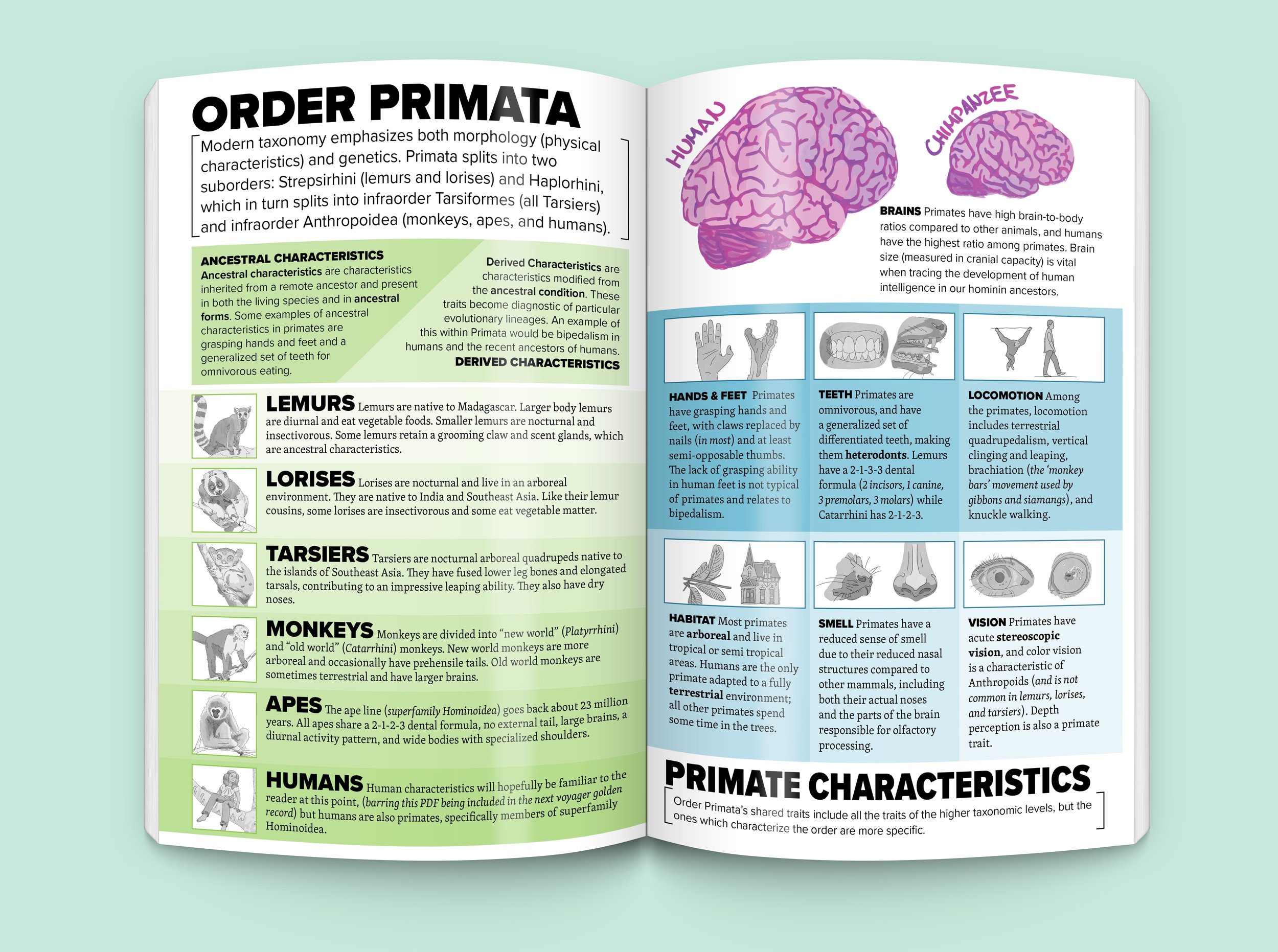
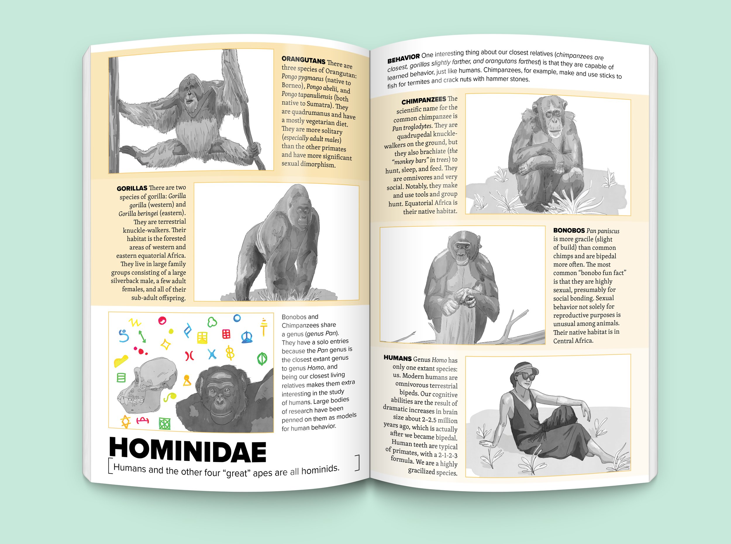

Process
Inspiration & Information
I began the work on Human Origins by gathering inspiration and reference material. Much of the factual content of the book came from Alyson Rollins’s Anthropology 102 and 215 classes, while the design inspiration ranged from Life Nature Library’s Early Man, the origin of the infamous March of Progress image, to Stand Still Stay Silent, a fantasy webcomic which happens to contain the best illustration of the Indo-European Language Family Tree on the internet.
Sketching & Drafting
As the early phases of the project progressed, I collected my class notes into one coherent informational document and began to sketch page layouts, focusing on maximizing information impact through image and color. As both writer and designer of the book, I had a unique opportunity to tailor the text and images to work in concert with the design.
Visual Development
Armed with a text document and preliminary sketches, I moved on to fleshing out the visual style, selecting type, color palettes, and types of illustration. For type, the book uses Proxima Nova and Skolar Latin, allowing both striking titles and academic-toned text. The ultimate colors were bright, including an entire rainbow of hues but limited to specific tones and shades. The book has two separate illustration styles: thick-stroked color digital painting for concept illustrations and diagrams, and grayscale digital drawings for accurate scientific images.
Layouts & Refinements
The longest phase of the project was the illustration and layout phase. Each page went through multiple rounds of changes as illustrations replaced placeholder images. Even the text changed, often being cut down to focus on only the most important information.


